Good Store Rebrand and Website Rebuild
The Good Store is a project by NYT best selling authors and vertical video sensations, Hank and John Green. The goal is make donating to charity easy and desirable for customers by selling them items that they already need in their life with a fun twist. Currently the Good Store sells socks, self care products, coffee, and tea, and plans to grow its subscription offerings on a yearly basis. The store then donates 100% of its profits after running costs and taxes to charity and as of 2025 has donated over $9 million.
Where we started
The Good Store originally started as three separate subscription brands, The Awesome Socks Club, The Awesome Coffee Club, and Sun Basin Soap. All three subscriptions were hosted on their own sites with radically different branding and themes.
What we needed to change
The Good Store rapidly expanded into the largest part of our business. We knew that we wanted to bring all three brands under one banner so that subscribers across the platforms could manage their subscriptions in one place.
Version 1.0 of this was a hastily built website that basically combined all three existing websites into one hydra, but created a confusing experience for customers as UI and UX was not standardized between tabs, and navigation was different on each store.
I was brought on as the art director to helm rebranding Good Store into one cohesive brand that housed multiple product lines.
Finding the brand
The first step to rebranding Good Store was understanding what this brand really was. We worked internally and externally with market researchers to identify the core tenants of the Good Store’s personality:
-
Unconventional - We give 100% of our profits to charity. We also try to highlight the work that goes into making these products, whether that is featuring artists and their design processes, or interviewing the farmers who grow our coffee beans. All aspects of the supply chain are important to us, and we want our customers to know exactly where a product comes from and how it got to them.
-
Good Fun - We were founded by some goofy guys, and a little bit of that still lingers in our branding. We want our voice to be modern and a little bit tongue and cheek. We’re very straightforward with our products, and that lends itself to some humor. Besides, you can’t write hundreds of words about socks with a straight face.
-
Thoughtful - From a product sourcing side, we put a LOT of work in assessing our suppliers and supply chains. Hopefully this comes through in the way we present ourselves online, we’re experts about our merchandise, and we’ve put in the work to make sure it is the best available.
-
World-building - The Good Store is about good products, but it is also about creating a better world. Since 2019 we’ve donated 9 Million dollars to charity. We funded a maternal center of excellence in Sierra Leone, both the building, training, and staffing, expanded access to cancer treatment world wide, and are currently embarking on a new campaign to prevent TB, a disease that is wholly preventable yet still kills one million people every year.
Based off of these personality traits I began to create mood boards, focusing on both graphic design styles as well as imagining the Good Store as an actual physical space. Even though the Good Store is currently an online only brand, imagining it as a store that we could walk into helped us determine the mood we wanted to set with the design.
We also knew that we wanted a character to represent our brand and came up with the idea of “Dot.” The legal name of the Good Store is Good.Store, and we decided to incorporate the dot both as a nod to this, and as the acknowledgment of the dot as punctuation, a place to pause and reflect. Dot is a character who inhabits the store that we are making and contains all of the personality traits that we decided on for the store.
The other challenge of finding our brand was understanding how this personality would encompass our existing product lines. All of them had very unique identities. Awesome socks was fun and colorful, Awesome Coffee was intense and process focused, while Sun Basin Soap was dreamy and poetic. Even though the goal of the rebrand was to smooth everything out style wise, we knew that each of the brands were marketed on their own merits for so long that we wouldn’t be able to totally rebrand them into Good Store without retaining some of their original character.
To solve this, we chose to order our personality traits per brand. For example, while each brand shares all of the personality traits of Good Store, Awesome Socks is weighted towards Good Fun, then Unconventional, then World-Building, and finally Thoughtful, where as Sun Basin Soap is Thoughtful, World-Building, Good Fun, Unconventional. By allowing each of the product lines to lean into different aspects of Good Store’s personality, they could retain individuality while working together under the same brand.
Design process
After establishing our mood boards and brand voice, we began the design of the Good Store logo. The existing logo was too generic for our brand, which we wanted to read as friendly and approachable as opposed to the third brand to the right on a whole foods shelf. In house we explored a few options, mocked up and designed by myself, and once we had the style points that we wanted to lean into identified, we engaged and I worked closely with Tributary design to nail down the final wordmark, logo, color palette, and design for “dot” our mascot.
Making a website
Design foundations in hand, we moved on to building the website. The first step of this process was outlining the functionality we wanted, and so based off of multi-team sessions, our website manager and myself sat down to wireframe our site focusing on how we wanted it to work. Once we’d nailed down the progression of pages, search functionality, etc, we then moved to applying the design to the foundations we’d created.
This process involved close work, daily feedback sessions, and constant communication with our website team and UI designers who worked closely from the style guide I provided.
Identifying voice
As the website progressed, I also began working on the voice that we would use for copy on our website and our social media. For both of these voices I decided to lean hard into the “Good fun” and “Thoughtful” aspects of the good store. “Good fun” because in my experience, the old adage “humor sells” is never incorrect, and “thoughtful” because while we want to be fun, we want that humor to have a solid grounding in the work that we are undertaking.
Photo Pickup
The website forged ever forward, the UI was coming together, the copy was nailed down, and for our last crowning effort, we needed some new photography.
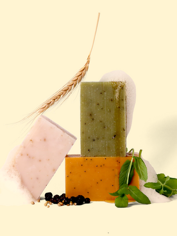
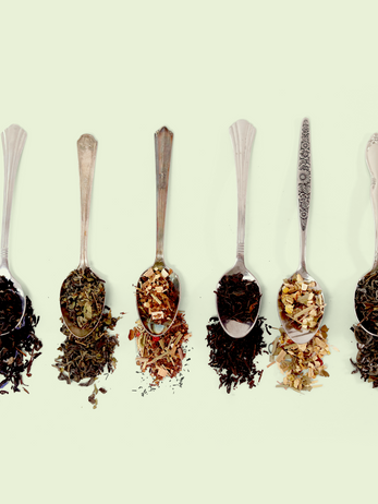
For this week-long shoot, I identified the theme of making the “ordinary extraordinary.” The thinking behind this is that the Good Store sells ordinary products, socks you wear each day, coffee that you start every morning with, and soap that you wash your hands with multiple times a day. But these little moments can combine to elevate your every day into something that is truly extraordinary.
To visually convey this, I used the concept of a black box theater, a minimal set that you can see from every angle, yet a set that still transports you into a different world. This being the case, I wanted to embrace the setup of backdrops and sandbags to show the reality of the photography, but create worlds within that setup that transported our models and products to an entirely different realm.
Final Product
And… Here is the final product. A cohesive, functioning website with a consistent voice, thoughtful photography, and a mission to do good that is baked into its very bones.


